
Beyond MAU: Visualising User Lifecycle Metrics in Evidence.dev, dbt, DuckDB (Part 3)
Metrics ans visualisations for a Product Analytics framework for mapping activation, retention, churn, and resurrection, so you can finally see the full story behind your active user numbers.

In Part 1, we looked at why lifecycle states matter. In Part 2, we built them step by step in SQL / dbt.
Now comes the fun part: dashboards.
I’ve created end-to-end project to demonstrate it. It works something like this:
Data generation (Python script) → DuckDB → dbt → Evidence.dev.
The code lives in this repo: https://github.com/rasmusengelbrecht/user_lifecycle_states (I used my Local Data Stack repo as a template).
Below I’ll quickly explain the data generation, then the transformation pipeline (refer to Part 2 for the lifecycle SQL), and finally walk through the dashboard visualizations and metrics with the SQL powering them and the business implications you should consider.

How the pieces fit together (high level)
Data generation (Python)
Script:
data_generation/generate_data.pyPurpose: create synthetic
usersandtransactionstables to demo the pipeline. It seeds reproducible behavior, simulates user lifecycle patterns (i.e. combinations of never_activated, new, retained, churned, reactivated, resurrected).Output:
usersandtransactionsDataFrames which are written into DuckDB.
DuckDB (local analytical store)
File:
dbt_project/data.duckdbThe Python loader connects to DuckDB and writes raw tables into schema
raw_data.usersandraw_data.transactions. This is the baseline for the dbt transformations.
dbt (transformations: staging → marts)
Project:
dbt_project/Staging models (
stg_users,stg_transactions) read fromraw_data.*and perform basic cleaning (canonical columns, truncating dates to month, null handling).Mart models include
dim_users,fct_transactions, andmart_user_state_monthly(the lifecycle table we built in Part 2). The lifecycle model outputs one row peruser × monthwithuser_state(Never Activated / New / Retained / Churned / Reactivated / Resurrected / Dormant) and other useful columns.
Evidence.dev (dashboards & visualisation layer)
Folder:
evidence_dashboard/Evidence connects to the DuckDB file and exposes SQL queries as chart sources. The pages use these to render MAU, Monthly Dynamics, Churn Rate, Pulse Ratio and data tables.
run.sh orchestrates the whole flow: generate → load → dbt run → start Evidence, so anyone can run the full stack locally.
The four visualisations: code, what they measure, and business interpretation
Below I present each chart, the SQL that powers it, and the business questions it helps answer. Remember, you can find all of the code in the repo.
1) Monthly Active Users (MAU)
SQL
with monthly_totals as (
    select
        month,
        count(*) as total_users,
        sum(case when is_active then 1 else 0 end) as active_users
    from user_states_monthly
    group by month
)
select
    month,
    active_users as user_count,
    active_users / total_users as mau_percentage
from monthly_totals
What it measures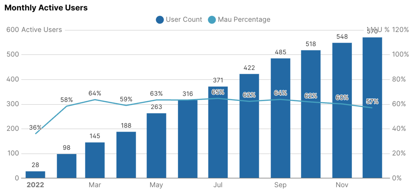
Evidence Visualisation code:
<BarChart
    data={mau}
    x="month"
    y="user_count"
    y2="mau_percentage"
    y2Fmt=pct0
    title="Monthly Active Users"
    labels=true
    yAxisTitle="Active Users"
    y2AxisTitle="MAU %"
    y2SeriesType=line
    chartAreaHeight=280
/>
Absolute active users each month.
Active users as a share of the entire user base.
Business implications
If
user_countgrows butmau_percentagefalls → acquisition is outpacing activation/retention (leaky bucket).If both rise → sustainable growth.
Use this chart as the running “headlines” metric, but never alone, always check composition (next chart).
Actionables
If MAU% drops after a marketing push, investigate onboarding funnel (segment by signup cohort).
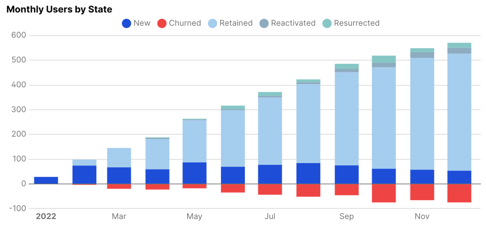
2) Monthly Dynamics (composition of MAU)
SQL
select
    month,
    user_state,
    case
        when user_state = 'Churned' then -count(*)
        else count(*)
    end as user_count
from user_states_monthly
where user_state in ('New', 'Retained', 'Reactivated', 'Resurrected', 'Churned')
group by month, user_state
order by month, user_state
Evidence Visualisation code:
<BarChart
    data={monthly_dynamics}
    x="month"
    y="user_count"
    series="user_state"
    title="Monthly Users by State"
    colorPalette={[
        '#1d4ed8',
        '#ef4444'  // Red for Churned
    ]}
    chartAreaHeight=280
/>
What it measures
How MAU is composed by lifecycle state. Churn is rendered negative to show outflows visually. The states above 0, are all of the active states, hence summing those would yield the Monthly Active Users.
Business implications
Spot which stream is driving net change: New (acquisition), Retained (stickiness), Reactivated/Resurrected (recovery), Churned (loss).
A spike in Reactivated following a campaign validates marketing; a spike in Churned after a product change would be a ⚠️ sign.
Actionables
Drill into cohorts and user segments for months with unusual composition shifts.
Tie ‘Reactivated’ spikes to campaign metadata (UTMs, emails etc).
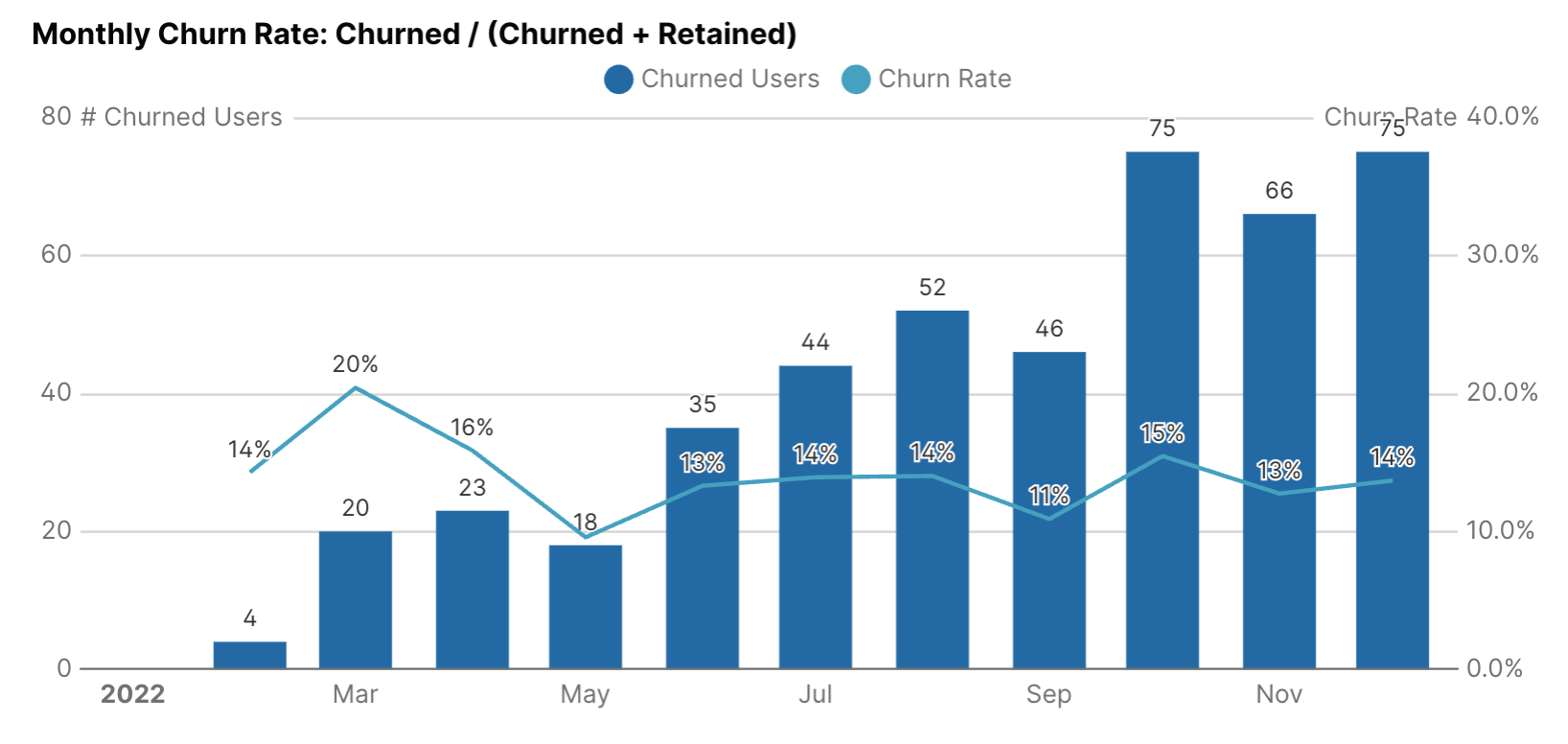
3) Monthly Churn Rate
SQL
select
    month,
    sum(case when user_state = 'Churned' then 1 else 0 end) as churned_users,
    sum(case when user_state = 'Retained' then 1 else 0 end) as retained_users,
    sum(case when user_state = 'Churned' then 1 else 0 end) /
    nullif(sum(case when user_state = 'Churned' then 1 else 0 end) +
           sum(case when user_state = 'Retained' then 1 else 0 end), 0) as churn_rate
from user_states_monthly
group by month
order by month
Evidence Visualisation code:
<BarChart
    data={churn_rate}
    x="month"
    y="churned_users"
    y2="churn_rate"
    title="Monthly Churn Rate: Churned / (Churned + Retained)"
    yAxisTitle="# Churned Users"
    y2AxisTitle="Churn Rate"
    y2Fmt=pct
    y2SeriesType=line
    chartAreaHeight=280
    labels=true
/>
What it measures
Churn rate defined as
Churned / (Churned + Retained), which is effectively the share of last-month-active users who dropped off.
Business implications
Churn is a risk metric: a rising churn rate is an early signal of product failure modes (lacking onboarding, UX regressions, pricing friction etc).
Actionables
Backfill with funnel data (where they drop off).
Segment churn by cohort, by first product action, and by acquisition channel to prioritise fixes.
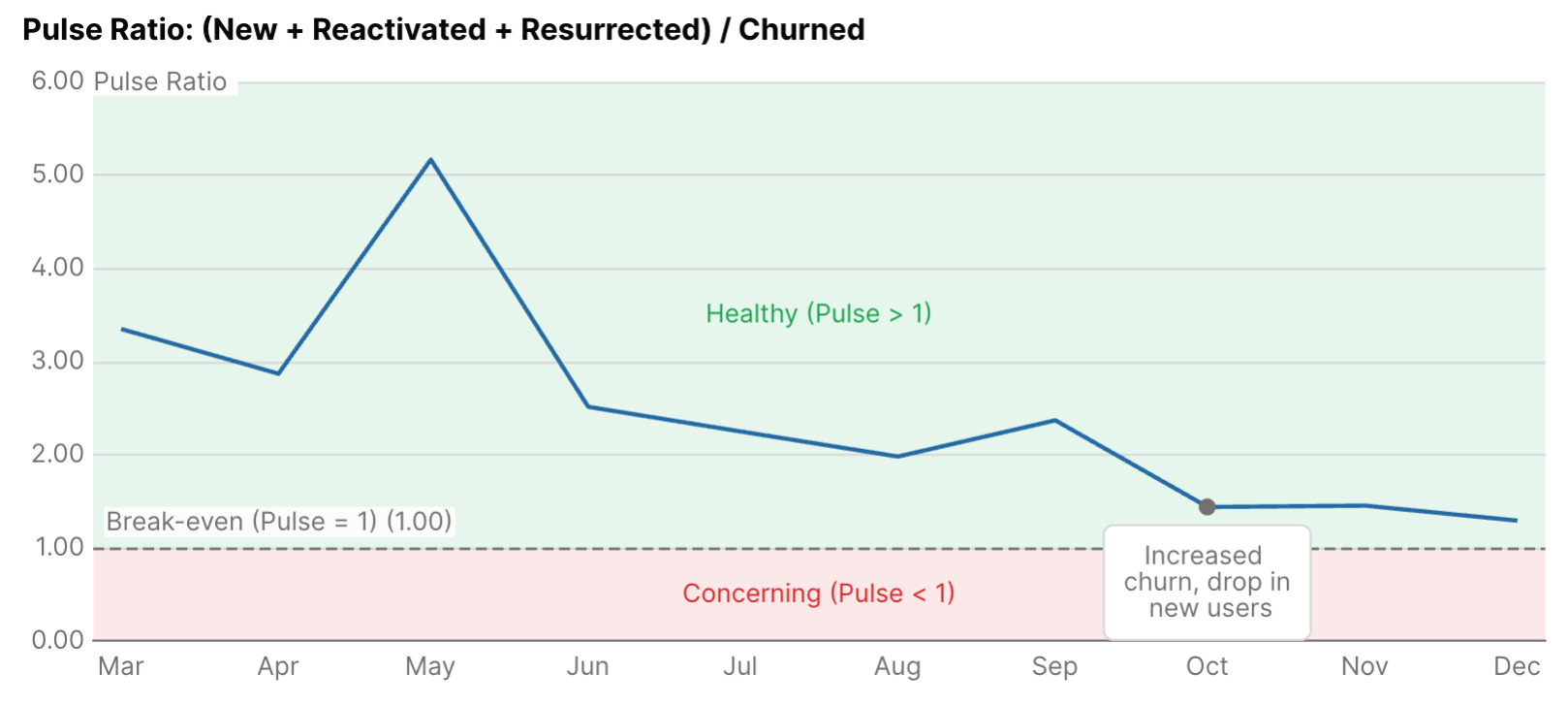
4) Pulse Ratio (net health)
SQL
select
    month,
    sum(case when user_state = 'New' then 1 else 0 end) as new_users,
    sum(case when user_state = 'Reactivated' then 1 else 0 end) as reactivated_users,
    sum(case when user_state = 'Resurrected' then 1 else 0 end) as resurrected_users,
    sum(case when user_state = 'Churned' then 1 else 0 end) as churned_users,
    (sum(case when user_state = 'New' then 1 else 0 end) +
     sum(case when user_state = 'Reactivated' then 1 else 0 end) +
     sum(case when user_state = 'Resurrected' then 1 else 0 end)) /
    nullif(sum(case when user_state = 'Churned' then 1 else 0 end), 0) as pulse_ratio
from user_states_monthly
group by month
order by month
Evidence Visualisation code:
<LineChart
    data={pulse_ratio}
    x="month"
    y="pulse_ratio"
    title="Pulse Ratio: (New + Reactivated + Resurrected) / Churned"
    yAxisTitle="Pulse Ratio"
    chartAreaHeight=280
>
    <ReferenceArea yMin=1 yMax=10 label="Healthy (Pulse > 1)" color=positive labelPosition=center/>
    <ReferenceArea yMin=0 yMax=1 label="Concerning (Pulse < 1)" color=negative labelPosition=center/>
    <ReferenceLine y=1 label="Break-even (Pulse = 1)" labelPosition=aboveStart/>
</LineChart>
What it measures
(New + Reactivated + Resurrected) / Churned: inflows (acquisition + recoveries) divided by outflows.
Business implications
Pulse above 1 = More users being acquired/recovered than churning (healthy growth)
Pulse below 1 = More users churning than being acquired/recovered (concerning trend)
Pulse = 1 = Balanced - equal acquisition/recovery and churn
Actionables
If Pulse < 1, prioritise retention experiments (onboarding, core loop tweaks) before pouring more acquisition dollars.
Other useful metrics
Other useful metrics
Once you’ve built the lifecycle states table, you unlock a range of additional metrics beyond the core charts above. A few worth mentioning:
First-month retention rate → % of New users who are Retained in their second month. Classic onboarding KPI.
Reactivation rate → % of last month’s Churned users who came back as Reactivated. Shows how well you win back drop-offs.
Resurrection rate → % of Dormant users who became Resurrected. Measures long-tail recovery of inactive users.
Time to activate → Average number of months it takes Never Activated users to finally become New. Reveals friction in adoption. (although I have a specific way of modelling funnel/conversion data, stay tuned for this in an upcoming post)
These all use the same lifecycle table, just aggregated differently, so once the model is in place, the extra work is minimal.
Wrapping up
With this end-to-end pipeline, you’re not just looking at MAU anymore. You can finally see where changes in MAU are coming from; is growth driven by new user acquisition, retention, or win-backs? Or is decline mostly churn, or stagnating new acquisition?
That’s the real story behind growth.
To recap:
Part 1 introduced the lifecycle framework (Never Activated, New, Retained, Churned, Reactivated, Resurrected, Dormant).
Part 2 showed how to actually build it in SQL/dbt.
Part 3 (this post) connects the dots into dashboards and metrics that make it actionable.
The repo is here if you want to try it locally: github.com/rasmusengelbrecht/user_lifecycle_states.
My advice: don’t stop at MAU. Once you break it down into lifecycle states, you’ll know exactly what’s moving the number, and where to focus your growth efforts.
One of the things I love about this model is how generic it is. You can define multiple versions of “activity”, not just overall product usage, but also adoption of specific features or behaviors all with the same framework.
That opens up a whole new layer: analyzing correlations between different user behaviors and features. I might write a Part 4 on that at some point 👀
If you liked this post series, please subscribe and let me know, so I can get a better understanding of whether this type of content is valuable to you ♥️