Open Source Metric Sheet Reports with Evidence.dev
Using Evidence.dev for self-hosted company performance reporting
On my first day in my first full-time data position, the CEO tasked me with creating a metric sheet that provided an overview of the company's current KPI performance. It made sense—A metric sheet provides a straightforward and easily digestible summary of the company's most essential metrics.

Luckily, we were doing a POC with Holistics, which offered a really nice Metric Sheet feature. Since then, I’ve seen various versions of metric sheets in different formats—Sheets, slide decks, BI tools, etc. However, most BI tools don’t provide an elegant way of visualizing a metric overview. Having worked with Looker for the past 3 years, I’ve certainly faced my challenges in building a clean metric overview.

In the past year, I’ve been using Evidence.dev as a great open-source alternative to building a Metric Sheet within the company’s BI tool. In addition to being free, another benefit is that by self-hosting your Evidence app, you can make the monthly reporting available to the entire company, without the need for logging in to the company BI tool using a paid seat. If you prefer sticking to Python, it’s possible to build something similar in Streamlit.
To provide some inspiration I created this Metric Sheet Web App as a simple example of how Evidence can be used for monthly reporting. It provides a clean and interactive way to track key metrics over time, with filters for month, market, and specific metrics. The project is built using dummy data and serves as a demonstration of Evidence’s capabilities.
Evidence.dev utilizes DuckDB under the hood to process the data directly in-memory. In this case, we calculate the growth rates in DuckDB, and hence, the underlying table only needs to include month, market, metric name, and metric value columns. With DuckDB’s window functions, we derive:
Month-over-Month (MoM) % Change – Compares the current value to the previous month.
Year-over-Year (YoY) % Change – Measures the annual growth rate by comparing values from the same month in the previous year.
3-Month & 12-Month Compound Growth Rates (CGRs) – Captures smoothed growth trends over time.
Historical Values for the Last 12 Months – Uses
ARRAY_AGG()to aggregate data for the past 12 months to be used for a sparkline visualisation.
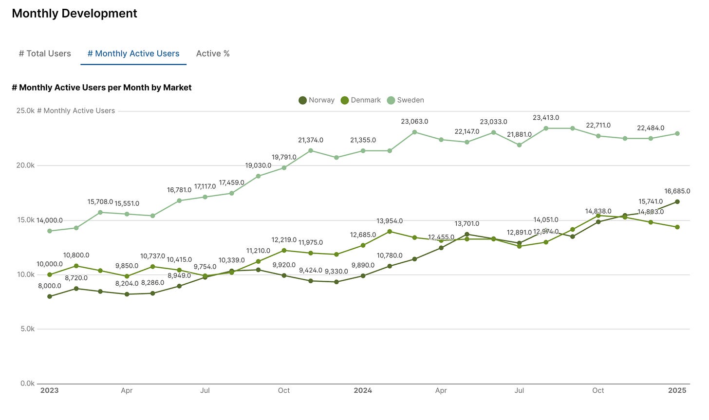
If you want to let stakeholders explore how metrics develop over time, you can add a filterable Line Chart below the Metric Sheet. This allows them to easily adjust filters and track trends across different markets, time periods, or specific metrics.
Building a good Metric Sheet has been a challenge across most BI tools I’ve worked with, but Evidence.dev has made it easier than ever. With DuckDB handling calculations on the fly, I finally have a setup that’s simple, flexible, and easy to share—without the usual BI tool headaches.
If you found the post interesting, consider subscribing:


